Showing posts with label colour. Show all posts

Friday, 28 June 2013

* Blushes*

I think I'm going a bit girlie. 


My favourite colour up until recently has always been a bold, bright red. And I thought I wasn't alone there.  I'm convinced I had heard or read something stating that red was the most popular colour amongst women, but a quick google told me otherwise... apparently it's blue. Same as the fellas. 

Scarlet red glass and sterling silver handcrafted earrings

Whilst hunting around for this mystical piece of research I'd once read, I did find out that  women see red differently to men. Where she sees crimson, burgundy, and tomato. He sees red. Just plain ol' red. Apparently the reason men can't see the many variations, is something to do with the X chromosome-and women have two X chromosomes, blah blah (sorry, can you tell I did a psychology degree?). 


Chalcedony and rose quartz earrings
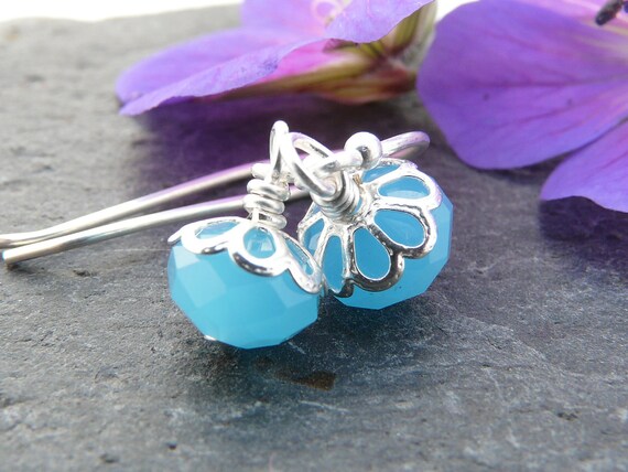
http://www.beckypearcedesigns.co.uk/beckypearceshop/prod_2679259-Chalcedony-and-rose-quartz-earrings.html
But anyway the point I was getting to is that I'm not finding red so appealing anymore. In fact, whilst I still do like it...(lots) (especially those velvet crimson red beads up there)  I think I'm being swayed to the dark side... or is it the light side ... well, you know erm, the pink side. 


Up until now I've never been a big fan of pink; probably because of it's gender associations. I'm even part of the Pink Stinks group on facebook. And having two girls made me even less inclined to it. Luckily my two have never had that pink thing. You know, where they have to have the pink cup. Or have to dress head to toe in a symphony of pinks. Bleugh. Shopping for girls clothes and toys has always got my back up... why does it all have to be bloomin pink?!

But, these days I'm being gently swayed towards it. 


Waterfall bead earrings

Maybe it's because I keep coming across all these lovely (and I mean really lovely) beads.
Maybe it's because these days I'm thinking about jewellery colours that look good on me (and other people) rather than just my favourite hues.
Maybe it's a fashion thing.
Maybe it's just because....


Pretty pink crystal earrings
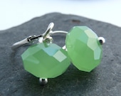
http://www.beckypearcedesigns.co.uk/beckypearceshop/prod_2691922-Pretty-pink-crystal-earrings.html
But I've noticed pinks creeping into my designs more and more. 


Stacking rings - lavender and pink
http://www.beckypearcedesigns.co.uk/beckypearceshop/prod_2692103-Stacking-rings-lavender-and-pink.html

I'm thinking it could be a summer thing, and I'll be back onto the rich reds and purples again when winter comes round again, but for now I'm in the pink.

In the interests of research I would be really interested to know what your favourite colour is... please leave a comment below if you have a minute. 

Tuesday, 26 July 2011

Pantone - Autumn 2011 Inspiration


Pantone, the powerhouse colour company have released their colours for Autumn 2011 and they are gorgeous.


Apparently, they have taken inspiration from the great masters and the sepia tones of old Hollywood.

I love orchid hush and quarry, that slightly chalky, milky quality is just what I've been looking for in beads recently. I bought these lovely milky glass beads a couple of weeks ago to use in earrings....


The only colour I couldn't instantly see looking fantastic in jewellery is bamboo, but I think that's because I'm a red head and avoid yellow at all costs. A quick look at the Starving Artists Team blog shows me I'm wrong...

Look at these beauties from Erika Price for example! Just lovely (on anyone but me!).

It just occured to me that it feels completely wrong to make anything that I wouldn't want to wear myself. Is it just me, or does everyone do that?


Sunday, 30 January 2011

Colour Palette - Bright and Shiny Earrings

I've just found a fab colour palette template from the brandi girl blog.

It's in Photoshop Elements, so I've downloaded the trial and am having a play around with it, to see if it will do better for my pictures than Picassa (which is free and nice and easy).


But whether it can or not, the fact that I can easily (with the help of the template!) make these cool little colour palettes is a definite plus.

Do you use photoshop? Does it get any easier??

Wednesday, 25 August 2010

Late Summer Pallete

One of the  things I love about the end of summer is the colours. The pale golds and pinky browns of the summer plants as they fade; the pale blue of the sky on those still warm  (but not very...) afternoons.


This is a real transition, the palette moves from summers bold, bright and fresh hues, to a more muted collection. The sun still feels warm, but the soft glow of dusk is noticably earlier. This is the week or two before the autumn show arrives with it's deeper reds, browns and ambers.


I am so sad that summer is nearly gone, it's been such fun and has gone way to quickly, but then again...I'm looking forward to cosying up for autumn
src="http://www.linkwithin.com/pixel.png" alt="Related Posts with Thumbnails" style="border: 0" />