
Pantone, the powerhouse colour company have released their colours for Autumn 2011 and they are gorgeous.
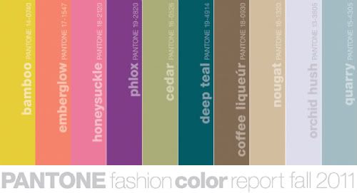
Apparently, they have taken inspiration from the great masters and the sepia tones of old Hollywood.
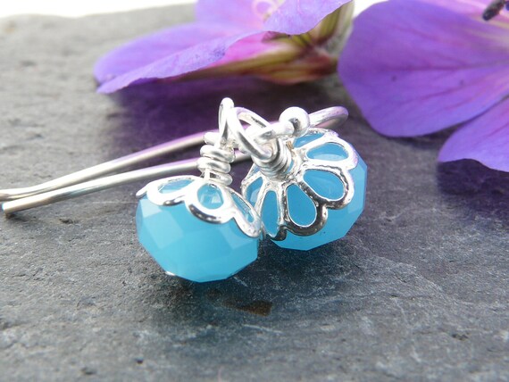
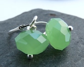
I love orchid hush and quarry, that slightly chalky, milky quality is just what I've been looking for in beads recently. I bought these lovely milky glass beads a couple of weeks ago to use in earrings....
The only colour I couldn't instantly see looking fantastic in jewellery is bamboo, but I think that's because I'm a red head and avoid yellow at all costs. A quick look at the Starving Artists Team blog shows me I'm wrong...

It just occured to me that it feels completely wrong to make anything that I wouldn't want to wear myself. Is it just me, or does everyone do that?
I love those milky beads too, Becky! Thank you so much for including my earrings in your feature!
ReplyDeleteI can't make anything that I wouldn't want to wear either. If I do it comes out all ugly and yuck. So you're not alone :)
ReplyDeleteBeautiful colours!
ReplyDeleteI must admit that I tend to make designs and use colours I like myself and very rarely use yellow. It's daft really cos something I hate maybe someone else would love!